Client:
Lyyra
Project:
Logo & brand identity
Lyyra, a classically trained vocal ensemble from London, needed a brand identity that reflected the sophistication and elegance of the music they perform.
This project was designed by Blake Kinne prior to the formation of 11B Studio, during his time at The Visual Brand, which retains the relationship to the client and rights to the artwork.
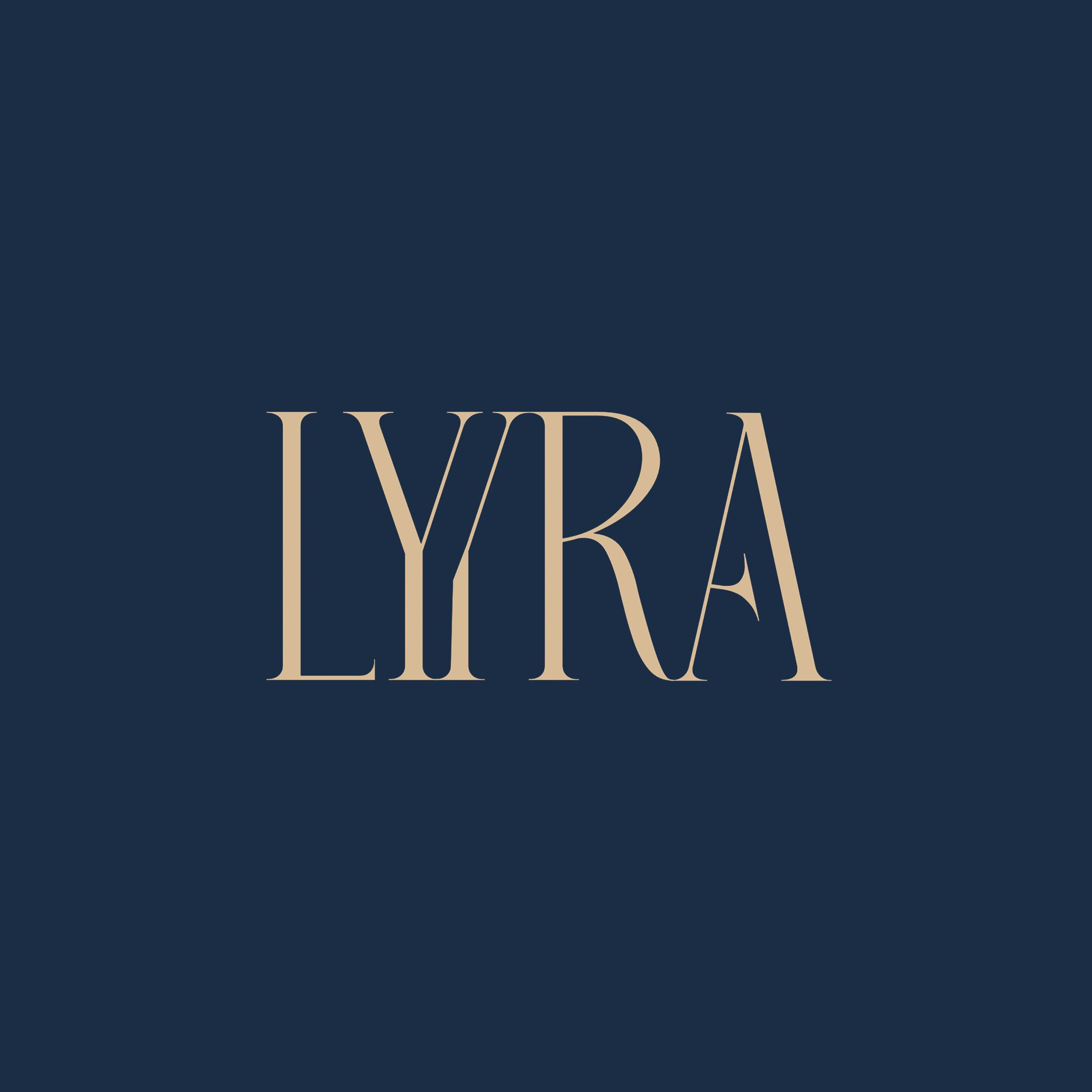
A custom serif wordmark was created, featuring a unique double-Y motif to visually capture the group's elegance along with their musical heritage.
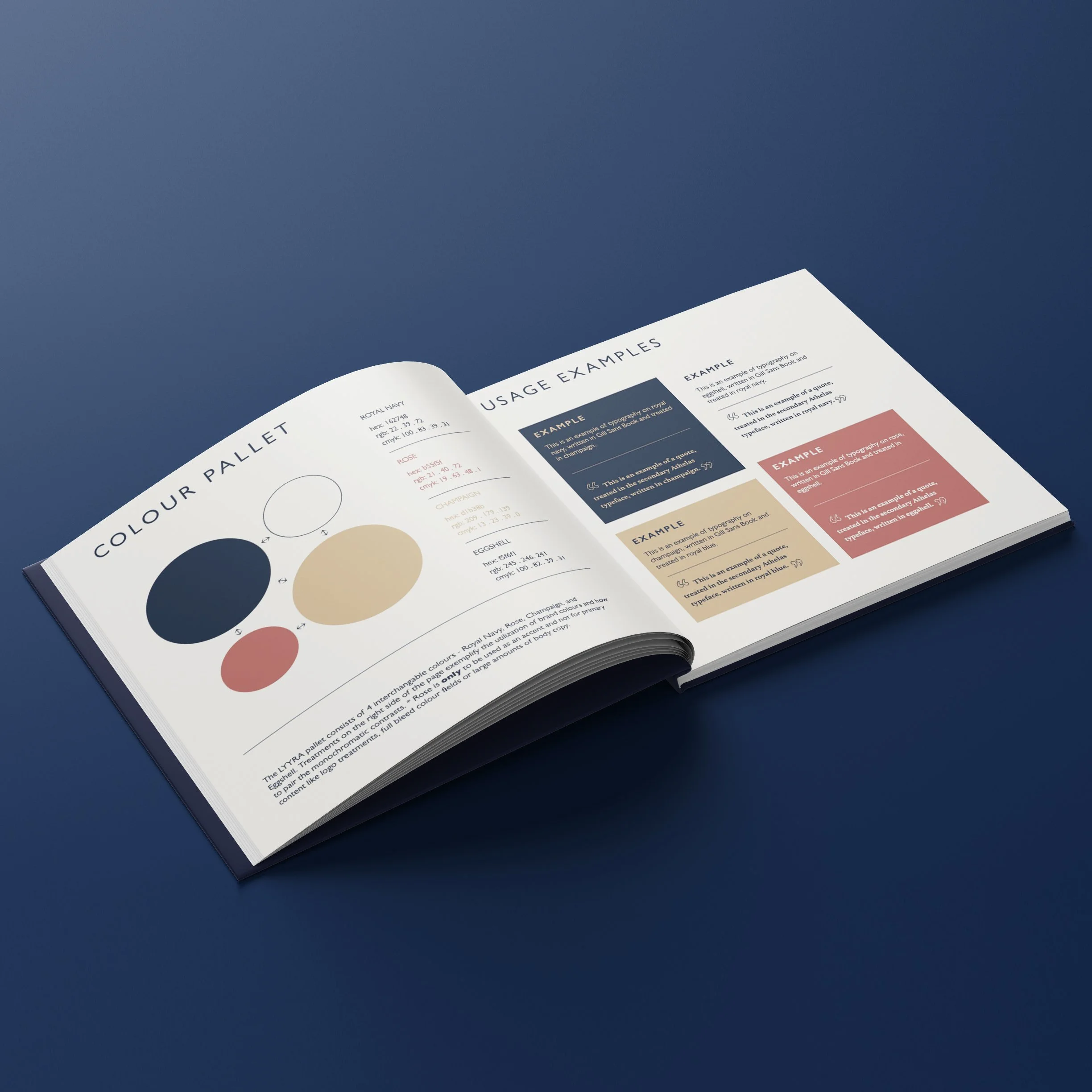
The color palette, composed of rich navy blue, champagne gold, and soft rose, was carefully chosen to convey a sense of prestige without leaning too heavily into either femininity or masculinity.

A pairing of a primary sans-serif and a secondary serif typeface was selected to merge modernity with classical sophistication, reflecting the group's mission to bridge the music of the past with the present, eloquently.
A minimalist outline icon style, in combination with geometric accent patterns, further enhances this balanced aesthetic for the brand.
