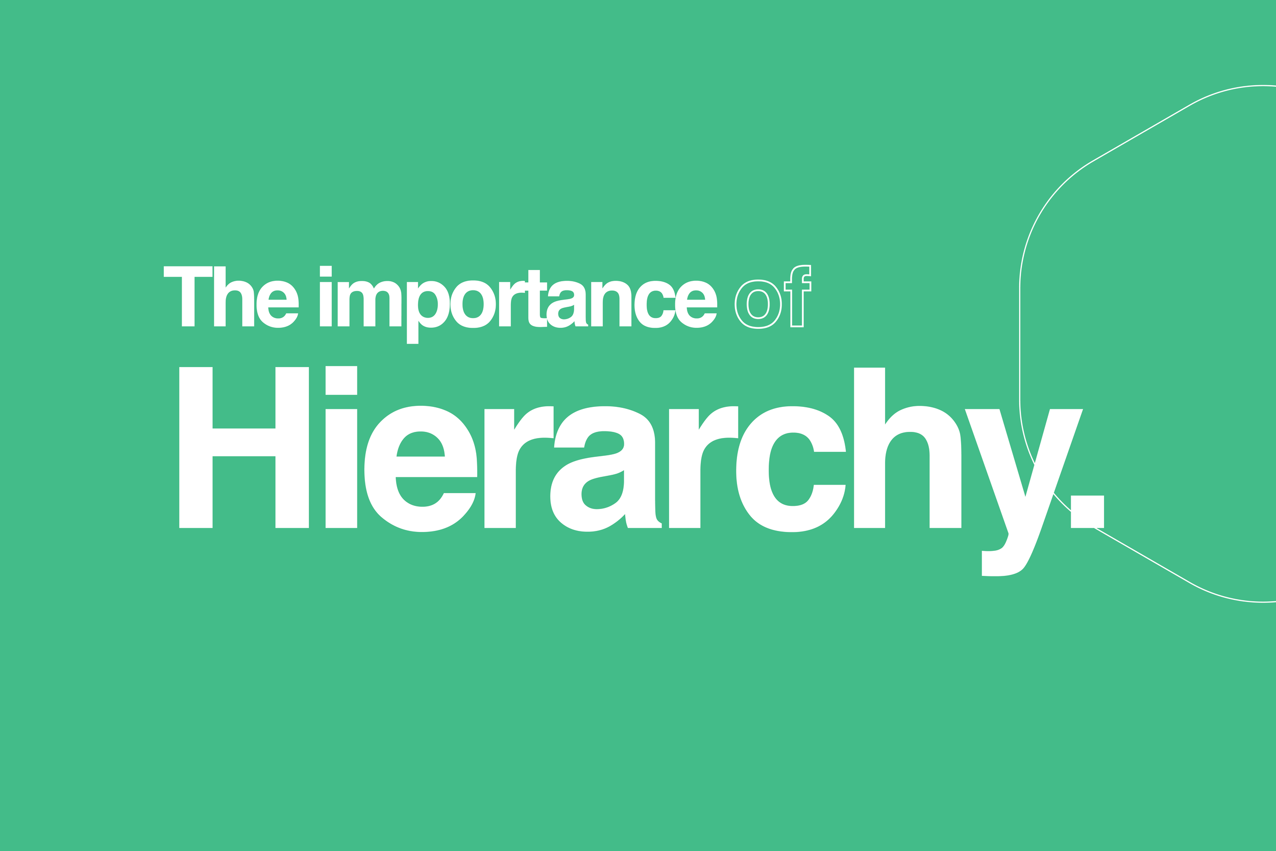
The Importance of Hierarchy
The fundamentals in effective communication for your brand.
In graphic design, informational hierarchy is key for clear communication. As designers, it's our job to guide the viewer’s eye. We create visual pathways that prioritize what matters most. When titles and body text are too similar in size or weight, they blend together. When secondary details like dates or captions are too prominent, they take attention away from the message.
Typographic layout should be intentional, intelligent, and intuitive. Our eyes are naturally drawn to bold taglines and emphasized words—so when we choose to highlight something, it must be done with purpose. Visual logic must set the cadence for the viewer's experience.
When a design lacks structure or rhythm in content-heavy layouts, readers can feel lost or disengaged. Ironically, the most successful designs often go unnoticed in their clarity because they guide the eye so naturally that the viewer stays immersed without realizing why.
Most designers know the basics—titles are largest, followed by subheadings, then body copy in descending size. But part of what makes design exciting is knowing when and how to break the rules. If done with thought and intention, breaking the hierarchy in moments the visual logic is still strong and clear can lead to fresh, surprising, and visually compelling work.
Ultimately, the best designers trust their intuition, even if this thinking happens subconsciously.